

Description
ShapeBlock adds 75+ blocks with ShapeBlock Pro to the WordPress block editor, plus a Header & Footer Builder.
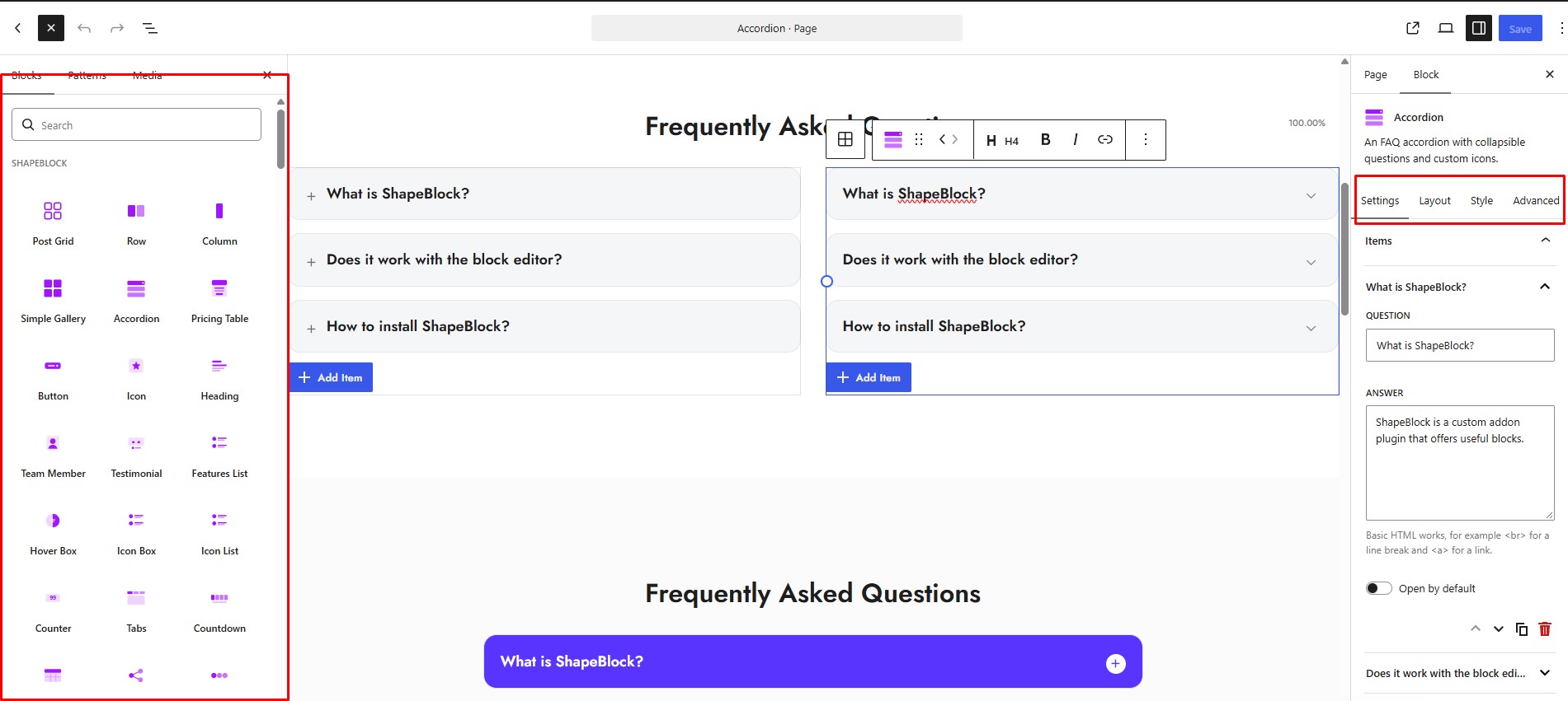
Every block has the same three tabs: Settings for the content, Layout for columns, alignment and spacing, and Style for colours, typography, borders, shadows and hover effects. Sizes, spacing and columns can be set separately for desktop, tablet and mobile.
Demo | Docs | Roadmap | Upgrade to Pro
Key Features
- 75+ blocks with Pro for layouts, content, media, navigation and marketing.
- Header & Footer Builder with Include and Exclude display conditions, for classic and block themes.
- Fully responsive – separate desktop, tablet and mobile values, and hide any block per device.
- Full design control – typography, gradients, borders, shadows, spacing and a built-in icon picker.
- Custom Templates – build a layout once and reuse it anywhere with a shortcode.
- Lightweight – each block loads its files only on pages that use it, and unused blocks can be switched off.
- Export & Import – move your settings and templates between sites in one file.
- Privacy friendly – no tracking unless you opt in, no CDN, and Google Fonts stays off until you turn it on.
Want more? Upgrade to ShapeBlock Pro
ShapeBlock Pro adds 42+ more blocks (75+ blocks with the free ones): 31 Pro blocks, 8 animation blocks and 3 WooCommerce blocks, plus 2 builders and 9+ extensions:
- Theme Builder – design single posts, pages, archives, search results and the 404 page with 13 dynamic blocks.
- Popup Builder – popups built with blocks, opened on page load, on scroll, on exit intent or on a click.
- Mega Menu – wide dropdown panels built from any blocks.
- WooCommerce Builder – your own product, shop, cart and checkout pages, plus Product Grid and Product Carousel.
- Motion Effects – entrance, scroll and mouse animations for any block.
- 8 animation blocks – Animation Title, Typewriter, Rotating Text, Scroll Text, Horizontal Scroll and more.
- Display Conditions – show or hide any block by user, role, date, time, page or device.
- Custom Code – Google Analytics, Tag Manager, a pixel or a live chat in your header or footer, without editing a theme file.
- Marquee, Table of Contents, Image Hotspot, Flip Box, Hero Slider, Timeline, Advanced Data Table and more Pro blocks.
Free Blocks
- Accordion – Collapsible question and answer sections.
- Breadcrumb – Shows visitors where they are on the site.
- Button – Buttons with icons, sizes and hover styles.
- Client Logo – A grid of client or partner logos with links, grayscale and hover-swap.
- Column – A column inside a Row, with its own width per device.
- Countdown – Counts down to a date and time.
- Counter – Animated number counters.
- Drop Caps – A paragraph that opens with a large first letter, plain, in a box, outlined or as an outlined letter, with optional newspaper columns.
- Features List – Feature lists with icons.
- Filterable List – A list of links with icons, filter buttons that count their items, badges and a search box.
- Google Map – A Google map of one place or several, with a list of the places, directions links and a gray, dark or warm look.
- Heading – Headings with typography, gradient and highlight options.
- Hover Box – An image or icon in a circle or square that shows a title and description on hover.
- Icon Box – Icon, heading and text together, in several layouts, with an optional button (text, icon or icon only).
- Icon List – A list where each item gets its own icon.
- Icon – A single icon with colour, size and link.
- Image Carousel – Several images at once, with centred slides and continuous scrolling.
- Image Comparison – Before / after images with a draggable handle – side by side, top and bottom, or corner to corner – with labels and several handle styles.
- Isotope Filter – A filterable grid with category buttons, an optional search box, and an icon, title, description and badge for each item.
- Menu – Shows a WordPress navigation menu with layout, alignment and colour options.
- Offcanvas – Slide-in panels for menus, sidebars or extra content.
- Post Grid – Posts in grid layouts, with pagination.
- Pricing Table – Pricing plans with features, badges and a button.
- Progress Bar – Animated progress and skill bars.
- Row – A responsive row that holds Column blocks, boxed, full width or a custom width.
- Scroll Top – A back-to-top button.
- Search – A search field you can put anywhere.
- Simple Gallery – An image gallery with spacing and column controls, and a popup with a choice of animations.
- Slider – A full-width image slider with arrows, dots and autoplay.
- Social Icon – Linked social icons, coloured all together or one by one.
- Social Share – Share buttons for the current page.
- Sticky Stack – Cards that stick as you scroll and stack over one another.
- Table – Tables with styled headers, rows and cells.
- Tabs – Tabbed content with icons and a few tab styles to pick from.
- Team Member – Team members with photo, role and social links.
- Testimonial – Testimonials in three styles, with ratings, quote icons and logos.
Header & Footer Builder
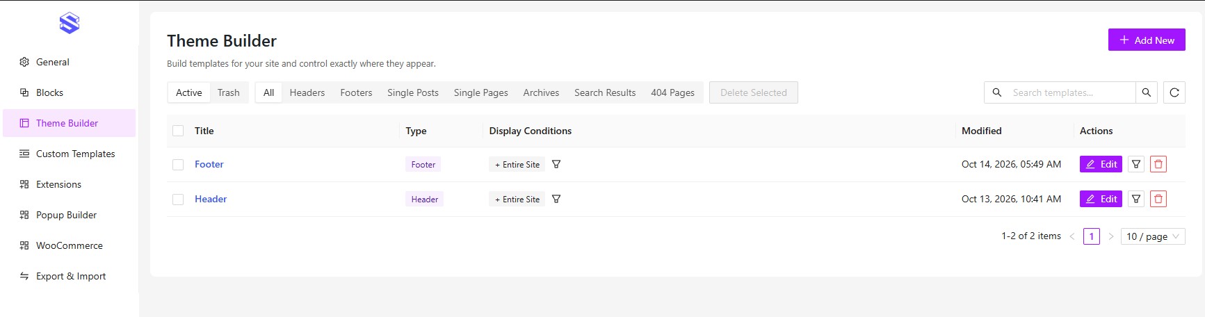
Build your header and footer in the block editor – no child theme and no PHP. Then pick where each one shows up with display conditions: Entire Site, Front Page, All Pages, All Posts, All Archives, Search Results, 404 Page, or specific pages and posts. Any condition can be set to Include or Exclude.
It works with classic and block themes. Pages that match none of your conditions keep the theme’s own header and footer. There’s also a Custom Block type you can place anywhere with the [shapeblock_builder] shortcode.
ShapeBlock Pro
Everything above is free and stays free. ShapeBlock Pro is a separate add-on that works on top of this plugin. It adds 42+ blocks (31 Pro blocks, 8 animation blocks and 3 WooCommerce blocks), 2 builders and 9+ extensions.
Pro Blocks (31)
- Advanced Accordion – sections that hold any blocks.
- Advanced Button – buttons with eight hover animations.
- Advanced Data Table – sort, search and page through a table.
- Clients Logo Slider – logos in a carousel or endless marquee.
- Comparison Table – plans side by side with ticks and prices.
- Flip Box – a box that turns over on hover.
- Hero Slider – full-width slides with heading and buttons.
- Image Hotspot – markers on an image that open popups.
- Marquee – text, logos, icons or any blocks moving in an endless line.
- Masonry Gallery – photos packed into tight columns.
- Mega Menu – wide dropdown panels built from blocks.
- Post Carousel – posts as cards in a slider.
- Price Menu – names, prices and short descriptions.
- Rating – stars, a score and a short note.
- Table of Contents – a list of the page headings that marks the section on screen.
- Team Member Carousel – your team in a sliding row.
- Timeline – a story step by step along a line.
- Video Player – YouTube, Vimeo or your own video, inline or popup.
- Post Title – the title of every post (Theme Builder).
- Featured Image – the featured image of every post (Theme Builder).
- Post Content – the text and blocks of every post (Theme Builder).
- Post Excerpt – a short summary of every post (Theme Builder).
- Post Meta – author, date, categories and comments (Theme Builder).
- Post Categories / Tags – the terms of every post (Theme Builder).
- Author Box – the author with photo and bio (Theme Builder).
- Post Pagination – links to the previous and next post (Theme Builder).
- Post Comments – comments and the comment form (Theme Builder).
- Related Posts – more posts from the same category (Theme Builder).
- Archive Title – the title of blog and category pages (Theme Builder).
- Archive Description – the description of a category or tag (Theme Builder).
- Archive Posts – the posts of a blog, category or search page (Theme Builder).
Animation Blocks (8)
- Animation Title – rotating words, drawn highlights and entrance effects.
- Animation Text – text that comes in letter by letter.
- Typewriter Effect – words that type themselves.
- Rotating Text – text turning in a circle.
- Scroll Text – big text that slides as you scroll.
- Image Reveal Effect – an image uncovered by a curtain.
- Image Scroll Trigger – an image that zooms or moves on scroll.
- Horizontal Scroll – a row that moves sideways on scroll.
WooCommerce Blocks (3) – need WooCommerce
- Product Grid – your products in a grid.
- Product Carousel – your products in a slider.
- WooCommerce Builder – product, shop, cart and checkout pages from 15 blocks.
Builders & Extensions (11)
- Theme Builder – Single Post, Page, Archive, Search and 404 templates.
- Popup Builder – popups built with blocks, on load, scroll, exit or click.
- Motion Effects – entrance, scroll and mouse animations for any block.
- Display Conditions – show or hide blocks by user, date, page or device.
- Parallax Background – a row background that moves slower than the page.
- Copy Style – copy one block’s look and paste it on others.
- Preloader – a loading screen, with your own logo.
- Scroll to Top – a back-to-top button on every page.
- Smooth Scrolling – gliding scroll and a styled scrollbar.
- Custom Cursor – a dot and ring that follow the mouse.
- Custom Code – code in the header, after the opening body tag or in the footer, such as Google Analytics or a live chat.
Also in Pro: Post Grid Filter adds category tabs, Load More and infinite scroll to the free Post Grid.
Get ShapeBlock Pro
External services
ShapeBlock connects to an outside service only in the cases below.
Google Fonts (optional, off by default)
Only after you turn it on under ShapeBlock > General: font files load from Google (fonts.googleapis.com and fonts.gstatic.com), which receives the visitor’s IP address, and the editor’s font list is fetched once a week from fonts.google.com by your server. By Google LLC: Terms of Service, Privacy Policy.
Appsero (only if you allow it)
Only if you click Allow: once a week your site sends api.appsero.com its URL and name, the admin email, first and last name, the WordPress, PHP and MySQL versions, locale, theme, the number of users and of active and inactive plugins, and the server IP (looked up from icanhazip.com). Without Allow nothing is sent, except a deactivation reason you type, and only when you click Submit & Deactivate. Appsero Privacy Policy, icanhazip FAQ.
Gravatar (Post Grid author picture)
When a Post Grid shows the author picture, it loads from Gravatar, which receives the visitor’s IP. By Automattic Inc.: Terms of Service, Privacy Policy.
Google Maps (Google Map block)
On a page with a Google Map block, the map loads from Google Maps, which receives the visitor’s IP (with Load on Click, only after the visitor clicks). By Google LLC: Terms of Service, Privacy Policy.
Social Share and Social Icon links
Plain links to Facebook, X (Twitter), LinkedIn, Pinterest, WhatsApp, Telegram, Reddit and the other networks you add; nothing is sent until a visitor clicks one, and then that network receives the page address and title.
Source code and build process
Every compiled file in the plugin ships with its readable source right beside it, except the Menu block, which is written by hand and has no build step:
- Blocks:
includes/public/blocks/<block>/src/, built into thebuild/folder next to it. The Menu block is hand-written inincludes/public/blocks/menu/build/and has no build step. - Admin dashboard:
src/in the plugin root, built intobuild/. - Stylesheets:
assets/css/style.scss,includes/public/assets/css/public.scssandassets/lib/bootstrap/bootstrap-grid.scss, each built beside its source.
Built with @wordpress/scripts and Dart Sass. To rebuild: npm install, then npm run build and npm run build:<block> (all script names are in package.json).
Credits
ShapeBlock is licensed GPLv2 or later and includes these MIT-licensed libraries:
- Swiper 12.0.3 (https://swiperjs.com) –
assets/lib/swiper/LICENSE, unmodified release files. - Bootstrap 5.3 grid (https://getbootstrap.com) –
assets/lib/bootstrap/LICENSE, only the grid, recompiled with ashapeblock-prefix. - Ant Design 6 and Ant Design Icons (https://ant.design) –
assets/lib/antd/LICENSE, used only in the admin dashboard. - Bootstrap Icons 1.13.1 (https://icons.getbootstrap.com) –
includes/public/assets/font/bootstrap-icons-LICENSE.txt, the icons of the built-in icon picker. - Appsero Client 2.0 (https://github.com/Appsero/client) –
includes/appsero/LICENSE, the opt-in usage data client described under External services.
The icon fonts were made with Fontello (https://fontello.com). Our own icons are GPLv2 or later; three come from Font Awesome 4.7 and Elusive Icons under the SIL Open Font License 1.1 (https://openfontlicense.org), listed in includes/public/assets/icon/config.json, with the licence and notices in includes/public/assets/font/OFL-LICENSE.txt.
Captures d’écrans
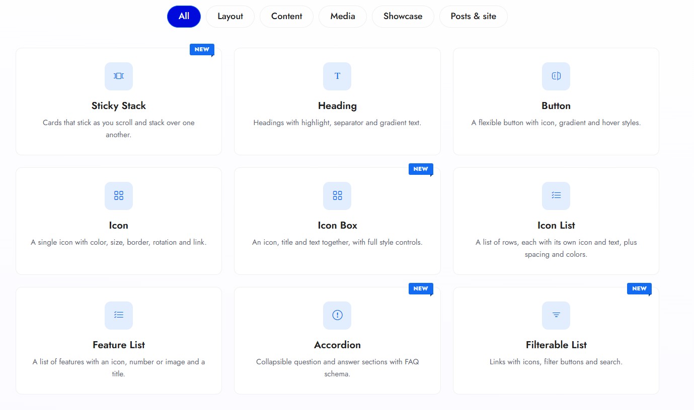
Blocs
Cette extension fournit 36 blocs.
- Row A flexible row container that holds columns. Build any layout with responsive presets, flexbox controls and per-device styling.
- Pricing Table A configurable pricing table with features list, featured ribbon and call-to-action button.
- Team Member A team member card typed in place, with 6 skins, social icons, email and phone, and an optional popup.
- Slider An image slider.
- Google Map A Google map of one place or several, with a list of the places beside it, directions links and a look that suits the page.
- Image Comparison A before / after image comparison slider with a draggable handle — horizontal or vertical.
- Icon List A list of items, each with an optional icon and a line of text.
- Progress Bar A progress / skill bar with title and percent — two layout styles and full styling.
- Column A column inside a ShapeBlock Row. Holds any block, including nested Rows.
- Image Carousel A multi-image carousel with centered slides and continuous scrolling.
- Simple Gallery A responsive image gallery with captions, hover effects and a lightbox.
- Icon A single icon with color, size, background, border, rotation and link.
- Hover Box An image or icon in a circle or square that reveals a title and description on hover.
- Table A table edited in place, with a header, body and footer. Cells can hold text, images and icon lists, with colors and borders for the whole table or for each cell.
- Social Icon A row of linked social icons with per-icon or global colors, hover states and full button styling.
- Breadcrumb A dynamic breadcrumb trail for the current page, with home icon, separator and full styling.
- Menu Build a navigation menu inside the block — add links and dropdowns, pick pages, descriptions, new-tab links, plus a responsive mobile menu.
- Sticky Stack Cards that stick to the top as you scroll and stack over one another, each with a number, title, text, points, image and button.
- Social Share Social share buttons for the current page — Facebook, X, LinkedIn, WhatsApp, copy link and more.
- Search A site search — popup lightbox skin or inline search field skin, with full styling.
- Filterable List A list of links with icons, filter buttons that show how many items each holds, and a search box to find an item.
- Post Grid Show your posts in a grid, with several card styles and pagination.
- Button A flexible button with icon, gradient and full style controls.
- Accordion An FAQ accordion with collapsible questions and custom icons.
- Countdown A countdown timer to a target date with days/hours/minutes/seconds, custom labels, separators and full styling.
- Icon Box Icon boxes with the icon on top, then title and description — icon, number or image supported.
- Heading A heading with sub-heading, highlight, separator, gradient text and watermark.
- Testimonial A grid of testimonials with three styles, ratings, quote icons and logos.
- Tabs Tabbed content with icon or image titles. Each tab holds any blocks, in a horizontal or vertical layout.
- Features List A vertical list of items with icon, number or image, title, description and optional connector.
- Scroll Top A floating scroll-to-top button that appears after scrolling and smoothly returns to the top.
- Counter An animated number counter with prefix/suffix, icon, title, and counter or odometer animation.
- Client Logo A responsive grid of client / partner logos with links, grayscale and hover-swap effects.
- Drop Caps A paragraph that opens with a large first letter across several lines, plain, in a box, outlined or as an outlined letter, with optional newspaper columns.
- Isotope Filter A filterable grid: category buttons on top, and under each category a list of items with icon, title and description.
- Offcanvas A toggle button that opens an off-canvas panel rendering a selected Template — classic side or modern fullscreen.
Installation
- Go to Plugins > Add New Plugin, search for « ShapeBlock » and click Install Now.
- Activate ShapeBlock from the Plugins screen.
- Open any post or page and add a ShapeBlock block from the block inserter.
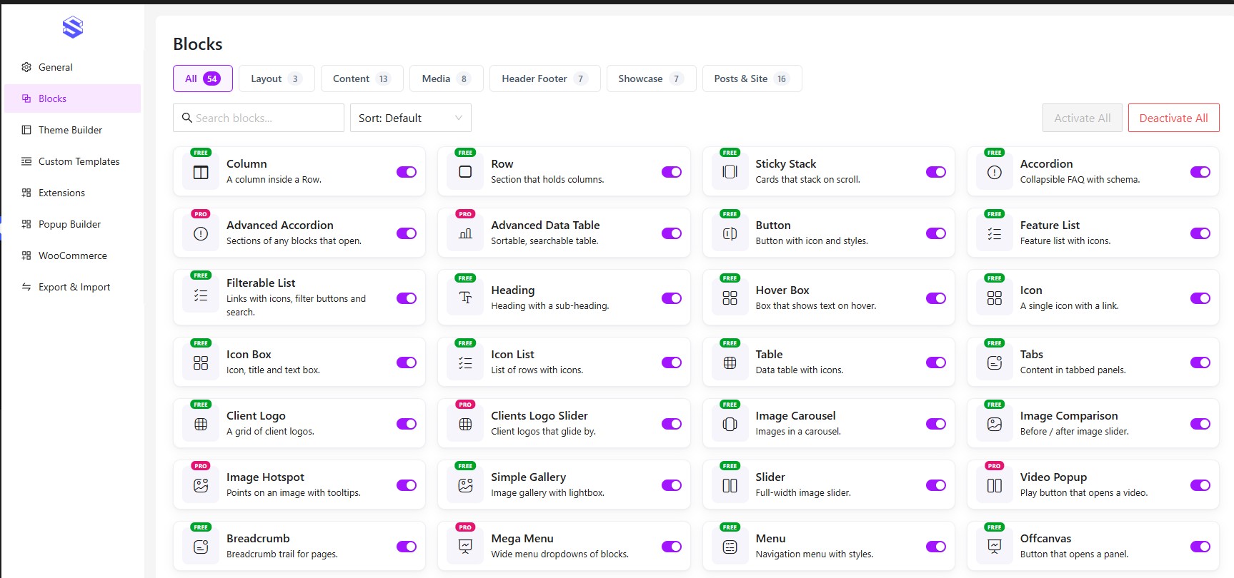
- Optional: visit ShapeBlock > Blocks Settings to turn off blocks you won’t use.
FAQ
-
Will it work with my theme?
-
Yes, with any well-coded theme, including block themes. The blocks pick up your theme’s typography, and you can restyle them from the block settings.
-
Do I have to use all 75+ blocks?
-
No. Turn off any you don’t need in ShapeBlock > Blocks Settings. A block that’s off isn’t registered and its files aren’t loaded.
-
Yes. Build one in ShapeBlock > Theme Builder and set where it should appear. Pages that don’t match your conditions keep the theme’s own header and footer.
-
Does ShapeBlock send any data to outside servers?
-
Not by default. See External services above.
-
What happens when I delete the plugin?
-
Deleting the plugin removes the options and cached data it created. Your Custom Templates, Theme Builder items and the blocks in your posts are your content, so they stay.
Avis
Il n’y a aucun avis pour cette extension.
Contributeurs/contributrices & développeurs/développeuses
« ShapeBlock – Powerful Gutenberg Blocks to Build Better Websites Faster » est un logiciel libre. Les personnes suivantes ont contribué à cette extension.
Contributeurs
Le développement vous intéresse ?
Parcourir le code, consulter le SVN dépôt, ou s’inscrire au journal de développement par RSS.
Journal des modifications
1.0.7
- New: Pro Features page – the new Pro blocks and extension are listed with their demo links: Marquee, Table of Contents and Custom Code.
- Improved: the Upgrade to Pro link under the settings of ShapeBlock blocks reads « Need all Pro blocks & Modules? » and keeps the link on one line.
- Improved: readme – the block and extension counts match what Free and Pro include: 75+ blocks with Pro.
- Improved: a smaller plugin – editor stylesheets that were never loaded and old icon font formats that no current browser uses are no longer shipped.
1.0.6
- New: ShapeBlock dashboard – Docs, Video Tutorials and Support links in the footer.
- New: Pro Features page in the ShapeBlock dashboard – a table of what Free and Pro include, with demo links.
- New: Upgrade to Pro links in the ShapeBlock dashboard, the ShapeBlock menu, the Plugins screen and under the settings of ShapeBlock blocks. These and the Pro Features page are hidden when ShapeBlock Pro is active.
1.0.5
- New: Google Map block – one place or several, with the places listed beside, under or over the map (click one to show it), directions and phone links, a gray, dark, warm or soft look, and Load on Click for privacy.
- New: Drop Caps block – a large first letter across 2 to 8 lines, plain, in a box, outlined or as an outlined letter, with text columns and a line between them.
- New: Advanced tab – a Position panel on every block: Absolute or Fixed, lined up with an edge or centred, with top, right, bottom and left offsets, width and z-index for each device.
- New: Column – a background image, with its size, position, repeat and attachment, as on the Row.
- New: Icon List – a link for each item (new tab and nofollow), an icon box with its own background, size and corner radius, items that slide towards their text when pointed at, and title typography.
- New: Filterable List – Mark as Hot adds a Hot label to an item.
- New: Client Logo – Add Logos picks several logos from the Media Library at once; the old button is now Add Empty Logo.
- Improved: Row – Position is Default or Sticky, with the sticky top offset right under it; margins can be negative, to pull a row up over the one above.
- Improved: Column – blocks side by side move onto more lines on a phone when they do not fit, instead of being squeezed out of the column.
- Improved: Blocks page – blocks are grouped in tabs.
- Improved: Pro Features page – a cleaner comparison table.
- Improved: Post Grid – the page links have padding, alignment (left, center or right), the space between them, the space above and typography for each device, and a box shadow for normal and hover; the hover colours also reach a Load More button.
- Improved: Post Grid – a post title turns to the primary colour when pointed at, and the date, author and category links change colour instead of showing an underline.
- Improved: Row and Column – border and border radius for each device; a width of 0 or the None style on Tablet or Mobile removes the border there.
- Improved: Search – the submit button has a border, border radius and a hover border colour; the hover colours also reach the button of the Input Field style.
- Fixed: The Padding and Margin fields no longer show a stray « Box Control » label.
- Improved: Image Carousel and Slider – images picked from the Media Library take the place of the empty starting slides.
- Improved: Table, Image Comparison and Isotope Filter – Wide and Full width follow the theme, as core blocks do; a wide table scrolls inside its own box instead of pushing out of a column.
- Improved: Countdown – the digits keep one width, so the timer does not shift as they change.
- Fixed: Theme Builder – when several templates of one kind fit a page, the most specific display condition now wins (a Front Page header over an Entire Site one, Category Pages over All Archives); before, the one edited last was used everywhere.
- Fixed: Theme Builder – a template saved before it had conditions still shows on the whole site; one whose conditions were all removed shows nowhere, and the list says so.
- Fixed: Typing in a block’s text on the canvas no longer loses the cursor or the last letters when another field of the block is saved.
- Fixed: Hover Box – without a link it can be tapped on a phone or reached with the Tab key to show its text, and its image fills the box.
- Fixed: Search – the icon colours now reach the built-in icons.
- Fixed: Team Member and Simple Gallery – captions are no longer cut off; Team Member’s first style stacks properly on a phone.
- Fixed: Testimonial – the third style’s stars, logo and author follow the alignment.
- Fixed: Progress Bar – the title and the percent line up; Feature List – the connector line shows over a section’s background.
- Fixed: Google Map, Icon List, Row and Post Grid – Wide and Full width follow the theme on every theme: they no longer stop short of the screen edge or run past a sidebar; Post Grid is no wider than the content on block themes, and the theme’s list indent no longer reaches the Google Map places.
- Fixed: Row – the layout picker reads « Choose a Layout ».
- Improved: Post Grid’s « Read More » label, the Search placeholder and the Row and Column background and overflow options can be translated.
- Improved: the usage-data notice stays answered after the plugin is deactivated and activated again.
- Fixed: a border thinner than 1px (such as 0.5px) is no longer dropped.
- Fixed: Accordion – opening or closing a question no longer makes the page jump or shake next to a sticky column.
- Fixed: Post Grid – a Pagination Type added by another plugin falls back to the numbered links when that plugin is switched off, so the grid never loses its paging.
1.0.4
- Security: Pricing Table – the old price colour and the features and button alignment are checked before they go into the page’s styles.
- Security: the optional feedback form shown when the plugin is deactivated only accepts its own reasons.
- Improved: FAQ – the title’s HTML tag is printed with WordPress’s tag escaping, like every other block.
- Improved: the check for a bulk plugin activation reads its flag through a filter.
- Improved: the bundled usage-data client (Appsero) has its own ShapeBlock namespace and hook names, so it no longer clashes with another plugin’s copy.
1.0.3
- Fixed: The Advanced tab’s padding, margin and background now show in the editor for every ShapeBlock block, not only on the page.
- Improved: In the editor, Ctrl+click (Cmd+click on a Mac) on a link inside a ShapeBlock block opens it in a new tab; a plain click still only selects the block.
- New: Table – edited in place like the core Table block: type in the cells, add and remove rows and columns from the toolbar, and a new table asks for its column and row count.
- New: Table – add text, heading and image blocks to a cell with its + button, or drag them in. Each cell has its own text colour, background (colour or gradient) and border. Plus fixed width cells and a caption.
- New: Table – sidebar like the core Table: Layout (Default or Stripes) and Style with Global (text colour, background, cell border, typography, padding) for the whole table and Cell for the clicked cell; Icon List blocks in cells.
- Improved: Table – the List View names each section Header, Body or Footer.
- Improved: Table – a simpler sidebar: Settings and Style, in plain words; a clicked cell’s own settings come first.
- New: Table – a tooltip for any cell, set in the cell’s settings; a new table has a light border round every cell.
- Improved: Table – turning a cell’s Tooltip on opens all its settings right there: text, icon, position, icon colour, size and margin, background and text colour. The tooltip’s icon colour, size and margin work with its default icon too, the tooltip has its own background and text colour, and it is never cut off by the table’s edge.
- Fix: Table – an Icon List in a cell keeps its own icon size; a border with no colour picked shows in light grey instead of not at all; a cell holding a block no longer shows an empty « Add text here » line in the editor.
- New: Pricing Table – the card is made of blocks (Heading, Price, List, Buttons), each edited in place with its own toolbar and settings; drag or add any other block into it. Existing tables keep their content and are converted when opened in the editor.
- New: Pricing Table – choose the feature icon: check, check in a circle, star, arrow or dot.
- New: Pricing Table – a new pricing table asks how many plans (1 to 4) and which style; two or more are added side by side, the same height, buttons in line.
- New: Pricing Table – three styles, Classic, Centered and Dark, each with a preview, and three ready-made pricing patterns in the inserter.
- New: Tabs – more tab bar settings: alignment (fill, left, centre, right), space between tabs, the width of side tabs (in Layout, under Tabs Position), background, padding and corners; tab buttons with Normal, Hover and Active colours, shadows and text alignment; icon and image size, icon box on or off with its size and corners, and the space to the title.
- New: Tabs – each tab’s content is blocks: type in it, or add or drag in any block. Tab titles are typed in the tab bar, and the + at its end adds a tab. Existing tabs keep their content.
- New: Team Member – edited in place: type the name, designation, bio, email and phone in the card, click the photo to change it, click a social icon to change its link or icon (the + adds one), and pick a skin from pictures; the text can also be changed in the sidebar, and the parts that show on hover stay open in the editor.
- New: Team Member – email and phone in every skin, as links that open the email app or the phone dialer; social icons in Skin 05 too.
- New: Team Member – an Icon Size option for the social icons.
- Improved: Team Member – the sidebar in plain words and order: Settings (Content, Email & Phone, Social Icons, When Clicked), Layout (Skin, Alignment, Photo Size) and Style from the card inwards (Card, Photo, Text Area, Name, Designation, Bio, Email & Phone, Social Icons).
- Fix: Team Member – on the Hover Overlay skin, the Name and Designation colours now win over the overlay’s Text Color; a click anywhere on the photo opens the Media Library.
- Fix: Team Member – a short photo no longer pushes the name and details off the card, and the editor matches the page; Items Gap, Name & Designation Area Margin (Inside Image), Social Icon Area Padding (Skin 04, Skin 05), Social Icon Alignment and Text Color (Skin 04 round overlay) now apply; Skin 05 shows its description on hover.
- Improved: Team Member – social icons line up with the text, fit in narrow cards, open in a new tab and have names for screen readers; a new Team Member starts with its icons, email and phone filled in.
- Improved: the block inserter puts the cursor in its search box when it opens.
- Changed: right after ShapeBlock is activated on its own from the Plugins screen, its Blocks page opens (once), to switch on the blocks you need. Activating several plugins together, or from WP-CLI, stays where it was.
- Changed: a new install starts with five blocks on (Row, Column, Heading, Button, Icon Box); the others are switched on in ShapeBlock > Blocks. Sites already using ShapeBlock keep every block on.
- Fix: Social Share – each network’s share page opens in a share window; Instagram, YouTube, TikTok, Snapchat, Discord and Spotify, which have no share link for websites, open the device’s share menu or copy the link; and blog, archive and Query Loop pages share the right address.
1.0.2
- New: Row – background image from the Media Library with a focal point, a background overlay, and text, link and heading colours.
- New: Row – typography for everything inside it, per device, and an ARIA label.
- New: Row – Columns per row on desktop, for a grid of equal columns.
- New: Row – select blocks and turn them into a Row (each block in its own column), turn a Group or Columns block into a Row, or Ungroup a Row.
- New: Social Share – three button styles: icon, icon with text, or text only, with editable names.
- New: Social Share – Normal and Hover tabs for the background (colour or gradient), the icon and text colour, and the border.
- New: Hover animations for the Icon, Social Icon and Social Share blocks.
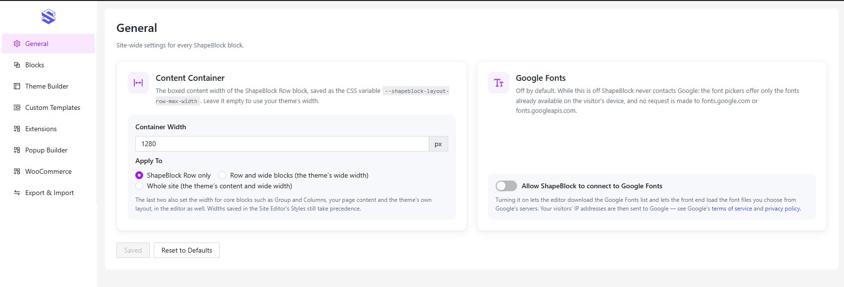
- New: the Container Width can also set the theme’s wide width, or its content width too, so core blocks follow it.
- Improved: the Container Width is empty by default and follows the theme until it is set.
- Improved: the General settings page is laid out in two cards.
- Fix: column widths set in px on tablet or mobile now apply on the front end.
- Fix: the Menu block keeps the selected menu when the editor reloads.
- Fix: Menu dropdown link padding no longer reaches into the links of a dropdown’s content.
- Fix: the editor no longer forces the Container Width onto all page content.
1.0.1
- New: Filterable List block – links with icons, filter buttons with item counts, badges and a search box.
- New: Isotope Filter – an optional search box beside the filter buttons, with a line below them.
- New: Row – a Custom content width, set per device.
- New: Icon Box – an optional button (text, text with icon, or icon only with its own size).
- New: Image Comparison – Before / After labels, a corner-to-corner direction and more handle styles.
- New: Simple Gallery – popup animations.
- New: Post Grid – more style and hover options, laid out more clearly.
- New: a gradient option on background colours.
- New: Theme Builder templates offer Wide and Full alignment in every theme.
- Fix: column widths in a Row now add up correctly whatever the number of columns, and a gap of 0 works.
- Fix: Row margin now applies in the editor and is no longer lost to the order stylesheets load in.
- Fix: colours can be cleared again, and Post Grid colour changes show in the editor.
1.0.0
- Initial release.